If you haven’t heard of the phrase ‘responsive web design’ before, it’s simply the practice of using fluid grid website layouts and media queries to render a website for different screen resolutions. To see it in action, open this article on a desktop browser and slowly make the browser thinner and then wider. You should see the elements of the page realign and the layout adjust to fit the new width of the browser. Below are a few screenshots of how this works on our own website.
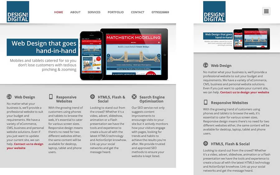
Desktop version of the Design for Digital website

Tablet & Phone versions of the Design for Digital website
Before the ‘responsive’ concept came about, you’d find that many websites catered for mobile phones by creating completely separate versions of the site (usually with an address like m.google.com), which because of the limitations left out many of the useful features that the desktop version had. This meant not only were owners having to create and manage multiple versions of their website but they also frustrated mobile visitors when they couldn’t access features on their mobile devices that they could on their laptop. With smart phones and tablets becoming more and more popular to browse the internet, something had to change. Thanks to the efforts of Ethan Marcotte, responsive design was born. He came up with the term ‘responsive’ to allow a website to ‘respond’ to your screen width through the use of fluid grids and media queries. You can read his article about responsive web design.
Fluid Grids
Without going into too much technical detail and baffling the non-technical reader, ‘fluid grids’ are used to fit content into. Think of them as flexible sections of an ‘elastic’ newspaper if you must. Images, text and video placed inside these defined content areas would adjust (not simply stretch to fit) to the containers size, which is determined by the browsers width. This example below shows a three column layout but notice how when we get down to smaller screen sizes the content can only adjust so much and starts to overlap, hence the need for media queries.
+ Media Queries
Add into the equation CSS (cascading stylesheets) ‘media queries’, brought about in the CSS version 3. These are bits of code your web browser reads behind the scenes to ‘style’ the page – think this as the ‘elastic’ newspaper’s printer. Media queries allow web designers to tell the browser that if it’s screen width is say less than 400px, then you need to use a different set of rules than the desktop version (~960px wide). Put these two principles together and you have a ‘responsive’ website. The example below shows the same three column layout but the containers now wrap when the page hits a certain width, so the content is readable. Try resizing your browser yourself to see it in action.
= Responsive
Designing for a responsive website is very different to the traditional web design principles. Instead of designing your website for a desktop layout and then adapting it for tablets and phones, you should in fact design it the other way around. First design for phones, then tablets and finally desktops. This way you’re getting the content structure positioned correctly and then you can add floats and other layout changes for bigger screens, cutting down on the amount of CSS requests.
Why you need a responsive website
It’s user-friendly, browser-friendly and almost every company is thinking about making their website responsive if they haven’t already implemented it! Tablet and mobile devices are becoming the best platforms for shopping and browsing online, with new devices and screen widths appearing all the time. Some predict the desktop to eventually be replaced by tablets and phones. So, without a responsive website, you’re leaving the user to ‘pinch & zoom’, slowing their experience down and giving your responsive competitors the edge when it comes to usability. The real question is, why wouldn’t you go responsive?
Then I need a responsive website!
So know you know the concept behind a responsive website, you’re probably wondering where to start to make your own website responsive. Well, that’s where Design for Digital come in. We’re specialists in responsive web design. We’d be happy to talk with you and suggest a suitable package. Just get in contact with us.
Please let us know your thoughts on this article via the comments or Tweeting @Design4Digital.